
10 Design Tricks That Make Any Room Feel Twice as Large
Across major American cities, living spaces are shrinking, redefining what comfort means. As urba...
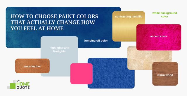
Have you ever noticed how some rooms feel easy to breathe in, while others make you want to leave right away? Many things shape our sense of comfort in a space. Lighting, layout, and proportions all play a role. Yet color remains the strongest influence of all. It is not just a decorative choice. It is a direct connection to your emotions and your subconscious. American designer Shea McGee said, "Color has the power to change the mood of a room more than any other element. It’s the most personal part of the design process because it’s all about how you want to feel in your space." Modern studies in neuroaesthetics support this idea. Scientists have found that color can affect cortisol levels, heart rate, and even sleep quality. Soft sky blues can encourage a sense of calm and help the body produce serotonin. Warm, earthy tones can create feelings of safety and stability. You do not need a degree in art to design a beautiful and comfortable interior. What really matters is learning the basics of balance and understanding how different shades affect your mood. Every color has its own character and energy. When you learn to work with them, you gain the key to creating a true place of comfort and strength. In this article, we will share simple professional tips to help you choose the perfect palette for your home. These ideas will help you build a space that supports your well-being every single day.

The first thing to do when you choose a color palette is to trust your own taste. There is no single correct way to combine colors. Look at your lifestyle and your wardrobe. The shades you choose for your clothes or save from magazines often feel most comfortable to you. Try to build a personal connection with color. Do not follow bright trends that change quickly. Think about how each tone affects your mood. Create rooms that match your inner comfort. You may want a calm blue bedroom. You may prefer an energetic and bold home office. In the end, your home should reflect your personality. Trust your own sense of style.
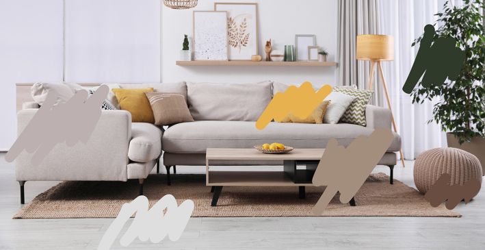
You can turn inspiration into a clear plan with a simple technique. Upload a favorite photo into a graphic editor on your phone or computer. Use the color picker tool to pull key shades directly from the image. Place those colors on top of the photo to create a quick palette. This helps you see right away how different tones work together. You can use this method with any visual source. Try it with a fabric you like or a landscape you admire. It turns vague ideas into a real and practical color scheme before you start painting.
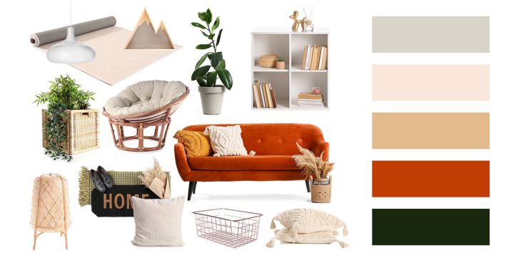
Simple graphic apps make it easy to build a useful collage. You can add wall colors, hardware samples, fabrics, and decorative accents. This visual method helps you spot design problems early and adjust your ideas before any real work begins. It is much easier to change a shade on a screen than to repaint finished walls. This saves both time and money. In the end, a carefully prepared mood board becomes a reliable filter for every future purchase you make for your home.

Lively and natural spaces do not look perfect or overly neat. They do not rely only on lighter versions of one main color. Use bold contrasts to shape the room. Mix deep dark accents with bright and airy touches of white. This helps you highlight important details and show off the character of the space. These shifts in tone create movement and keep the eye engaged.
A well chosen range of supporting colors makes an interior feel layered and complete. It turns an ordinary room into a balanced and thoughtful space.

Even modern interiors with neutral gray or white colors need some warmth. Without it, a room can feel too cold and sterile. Add natural walnut wood, caramel leather, or brass details to bring in comfort and character. These touches warm up the space without taking away its light and fresh feel. A balanced palette keeps cool walls in harmony with warm textures and décor. This creates a sense of comfort that stays pleasant over time.
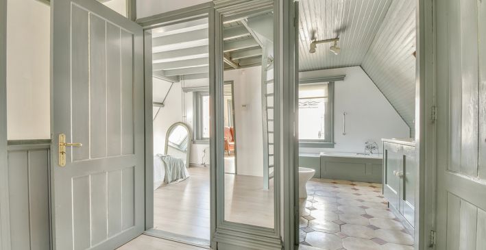
The easiest way to do this is to choose one key color and use it in different amounts. In one room, it can become the main wall color. In another room, it can appear only as a small accent in décor or textiles. This method lets each space keep its own personality. At the same time, it ties the whole home together into one harmonious system. Furniture and finishes then fit naturally into the overall design.
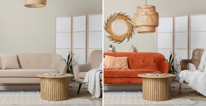
Trying to match wall colors perfectly with tiles or furniture often makes a room feel heavy and flat. It can take away depth and interest from the interior. Instead of using identical shades, look for colors that complement each other. For example, pair cool blue walls with soft peach tones or warm neutral accents. This creates a more natural and balanced look. The more textures and bold items you add to a room, the calmer your wall color should be. A light and muted base gives the eyes a place to rest and helps décor pieces stand out.
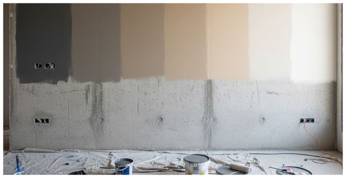
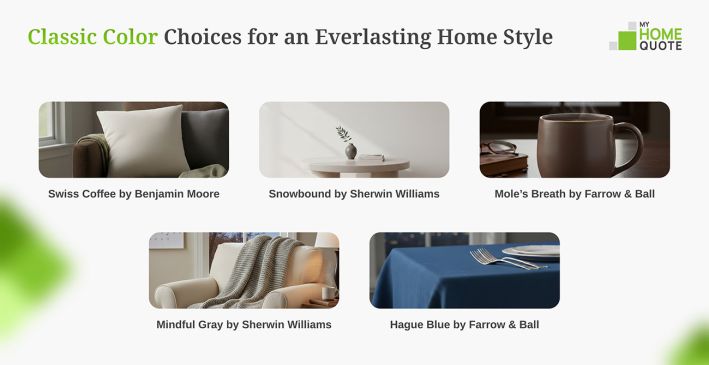
A timeless, versatile white with just the right touch of warmth. It creates an inviting atmosphere and is the perfect choice for hallways and transitional spaces. Essential, sophisticated, and always dependable.
A versatile cool white with a subtle gray undertone that brings a sense of calm and sophistication. Like stepping into a snowy glade, it pairs beautifully with gray-influenced tones for a clean, modern feel.
A deep, timeless grey with a mushroom-toned warmth that creates an atmosphere of instant coziness and sophisticated moodiness. This versatile accent works perfectly to ground a space or turn a small room into a beautifully "sullen" yet snug sanctuary.
A warm and inviting "greige" that seamlessly blends gray and beige undertones to create a timeless, balanced atmosphere. While trends may shift, Mindful Gray remains a staple for those seeking a sophisticated look with subtle hints of blue and green that add depth without overwhelming the space.
Hague Blue is a deep, dramatic blue with green undertones, inspired by traditional Dutch woodwork and suitable for both indoor and outdoor use. Its timeless character makes it an ideal choice for grounding skirtings or creating a sophisticated atmosphere in small, dark spaces.
GET THE ESSENCE OF RELEVANT HOME
IMPROVEMENT TOPICS IN LESS THAN 5 MINUTES

10 Design Tricks That Make Any Room Feel Twice as Large
Across major American cities, living spaces are shrinking, redefining what comfort means. As urba...
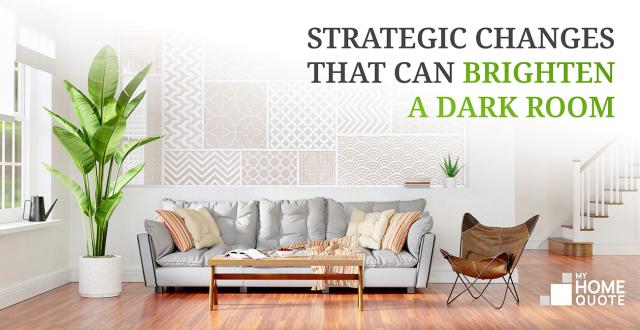
A lack of light in a home usually stems from poor architectural planning, low ceilings, north-fac...

Thanks for joining our homeowners’ community.
Stay tuned!
Choose the category
Choose the category